Offering Management Dashboard
Tools Used: Illustrator, Tableau, SQL, Excel
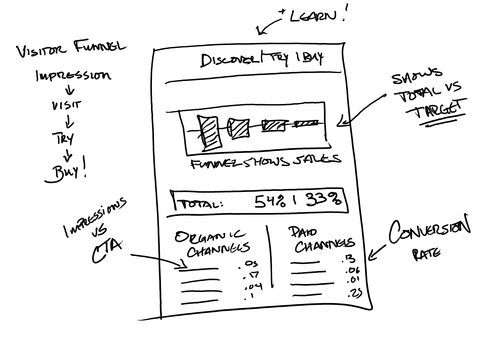
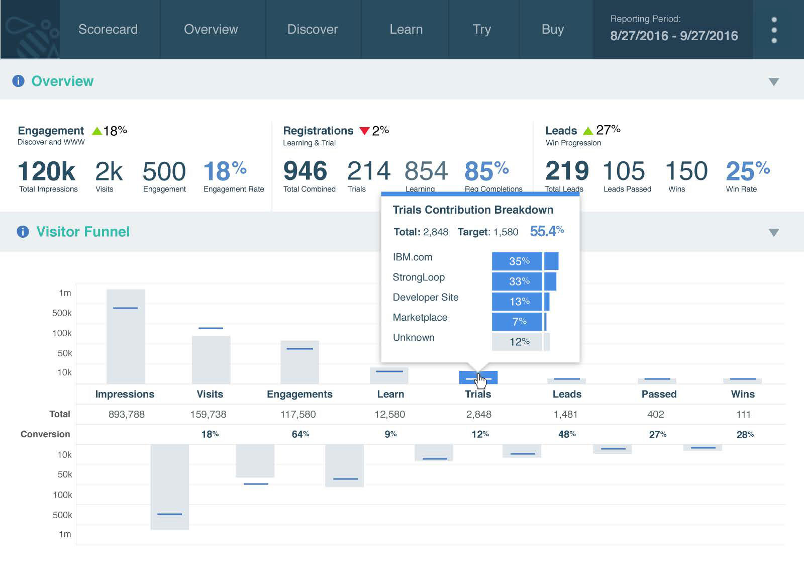
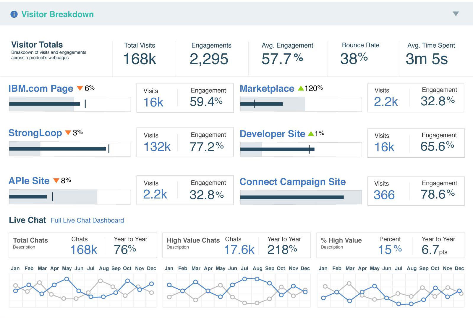
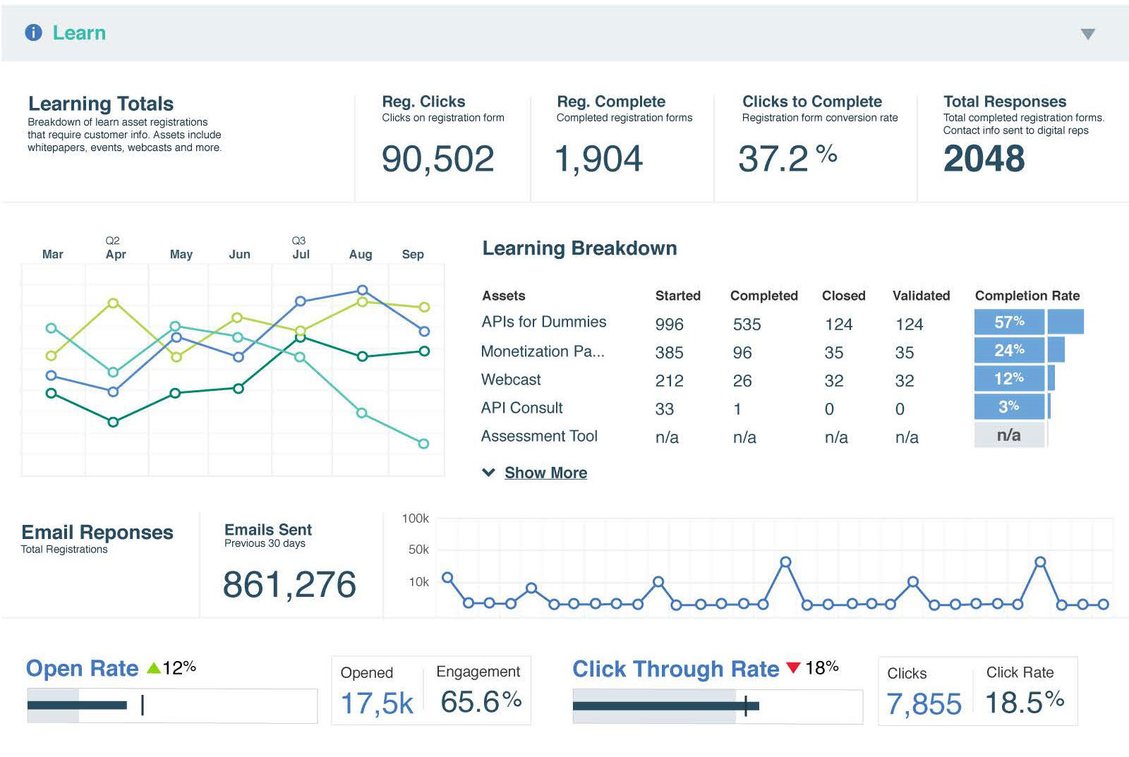
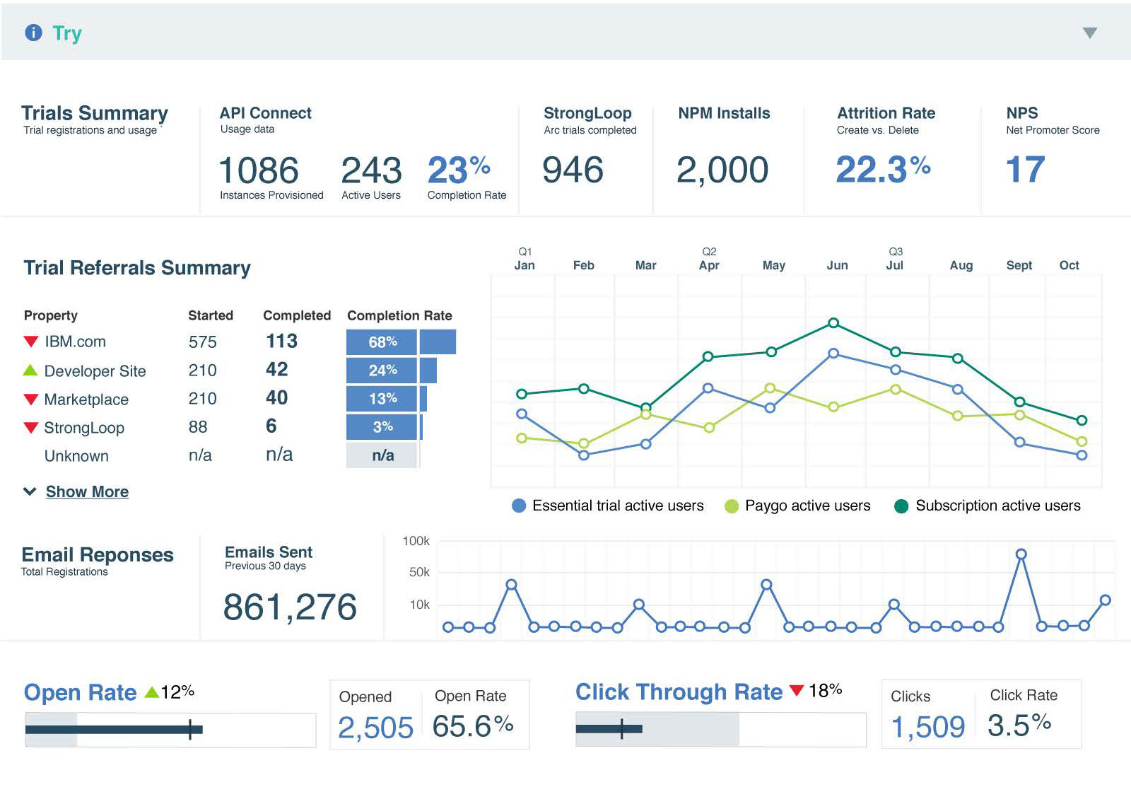
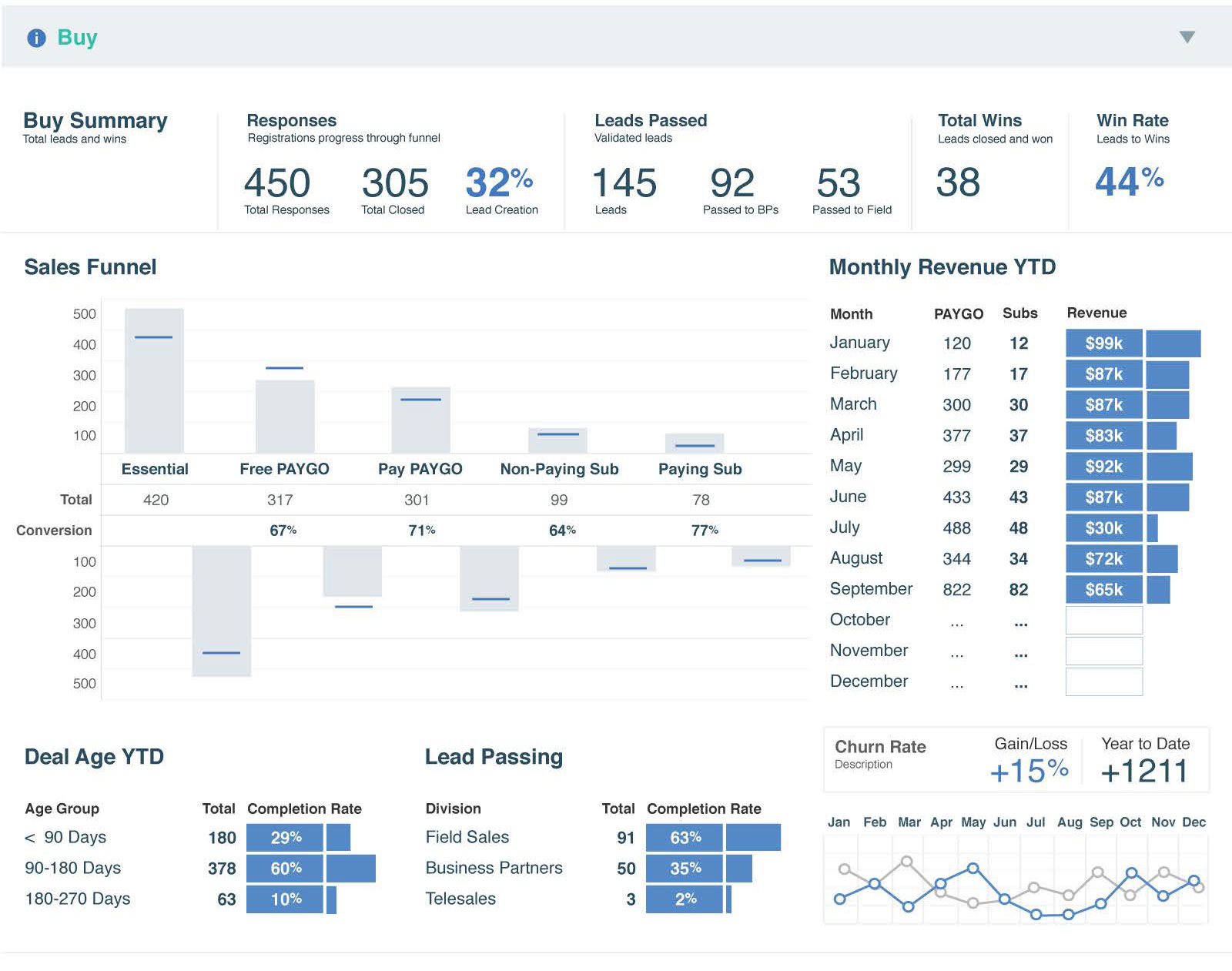
The OM Dashboard was an effort led by IBM API Connect offering managers to identify and monitor key performance indicators in the Discover > Try > Buy flow. The goal of the dashboard was to encourage offering managers to engage with product analytics, therefore making better and more informed decisions about the product. The data was sourced from the IBM Data Lake and updated live.
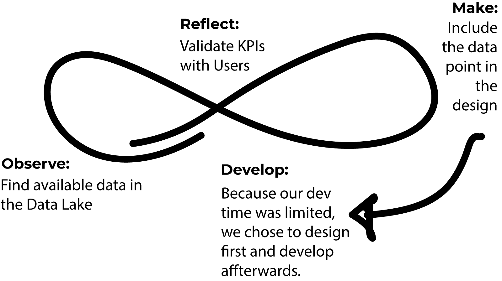
My role was design and data visualization. The product was designed in Illustrator and implemented in Tableau. KPIs were validated by interviewing stakeholders and users of the product. The product was intended for an internal audience.
My Impact
- The art of the possible! With just a small team, we brought Kelly's vision to life, from concept to execution
- Demonstrated the value of design thinking principles to a skeptical group of offering managers
- Improved offering managers' ability to make data-backed decisions about product features and KPIs
- One dashboard to rule them all, and in the darkness bind them
The Team
- Kelly H. - Offering Manager
- Alan U. - Design Lead
- Austin L. - Design Intern
- Stephanie P. - Tableau Developer
User Research & KPI Validation
Since this was a grassroots tool for internal users, finding sponsor users was relatively straightforward. Kelly consulted the pool of APIC offering managers for key performance indicators that they considered valuable. We searched the available data sources for data, and where it matched, we designed in a space for it. The fluid nature of this design process meant that our design changed as we received feedback, but only when data was available.
"You're not going to do any of that design thinking mumbo-jumbo, are you?" Kelly H., Offering Manager
Visual Design
The design was blocked out in Illustrator using basic shapes as the data was confirmed. Since we had limited development resources for Tableau, we focused most of our prototypiing efforts on Illustrator. We hallway tested our designs by asking Offering Managers to find a specific KPI and interpret the meaning of it.

Design & Development
It was actually really hard to do this in Tableau. We should have submitted it for an award, but our design team wasn't mature enough at that time to have support for that (yet!). The developer listed on the team above was actually a consultant hired from Tableau itself. That's even stranger when you consider the fact that IBM makes a competing product.

Napkin Sketch Wireframe